Who is your sign’s target audience?
- Customers / Clients
- Employees
- Members
- Patients
- Guests
- Visitors
- Students
Are you targeting foot or vehicular traffic?
What is the purpose of your sign?
- Advertise?
- Identify?
- Sell?
- Warn?
- Inform?
- Direct?
What are you attempting to accomplish with your sign?
- Attract new customers?
- Promote a special event or seasonal sale?
- Impress your clients with a professional high-end corporate appearance?
- Comply with government regulatory requirements?
- Some examples are:
- “Fire Exit”
- “Pool Safety rules”
- Identify your building so that people can find you?
- Improve name recognition?
- Promote impulse purchases?
- Help prevent accidents or injuries and reduce liability?
- Provide directions (parking, identify entrances, exits, and guidance)?
- Inform or educate the reader?
What type of material do you want to create your sign out of?
There are many types of materials used to create signs. We have found the following to work well for our clients.
- Coroplast is corrugated plastic sheet that creates a quality sign which is waterproof and can be used indoors and out. All our coroplast signs are created using adhesive vinyl lettering or images for long-lasting durability and will stand up to the elements no matter where you live.
Coroplast can be made to your selected layout size. For each coroplast sign, you can choose as many images as you want to fill up to a 48×96 inch sheet. We have several standard sign sizes for you to choose from. The most popular sizes are 12”x18”, 18”x24”, 24”x36”,48”x48” as well as the 48”x96” though we can do any size in-between.
One reason to use coroplast is that it is eco-friendly. The durability of the material is tough. You can use the signs for a long time. Coroplast uses polypropylene copolymers, which are recyclable and biodegradable.
- Aluminum is another durable material for a quality sign that can be used indoors or out. It is favored for business signs because of it’s long-lasting and rust proof.
As with coroplast an Aluminum sign comes in any size up to 48×96,. Here again you can choose as many images as you want to fill up the sheet. We have several standard sign sizes for you to choose from. The most popular sizes are 12”x18”, 18”x24”, 24”x36”,48”x48” as well as the 48”x96” though we can do any size in-between.
- Vinyl Banners are a good choice when you want something temporary for a special event. It can be moved to other venues and used over again for years.
All of our prefabricated banners are produced from a 12.5-ounce outdoor vinyl hemmed on all sides and have our best quality grommets. This kind of banner gives you a sturdy product that will outlast tough weather conditions and stick around for years. You can count on our banners being resistant to water and bad weather. They will look awesome inside your building as well.
We keep a number of standard sizes of white banners in stock but we can get almost any size up to a 6’x20′ banner in a short time. Here again you can choose as many images as you want to fill up the banner. We have several standard sign sizes for you to choose from. The most popular sizes we keep in stock are 2’x4′, 2’x5′, 2x’6′, 2’x8′ 3’x6′, 3’x8′, 3’x10′, 4’x6′ and 4’x8′ though we can do any size in-between.
- Our Vehicle Magnets provide a perfect solution for low-cost vehicle advertising while delivering high exposure.The 30 mil. high-quality Magnum Magnetic material sticks to almost all vehicles. This magnetic material is easy to install and remove.
Standard sizes for our magnets are 12×24 inches. We have found in our many years in the signs industry that this size will fit the needs of most people though we can do a number of different sizes.
7 Secrets of Sign Design
Want your signage to be stunning and attract attention? Well here are 7 secrets to help in the process. Miss just one of these tips and your sign will not be doing what you want (attracting the attention of your intended audience).
1) Make sure that your message is clear and concise.
When your sign is viewed by a passing motorist you only have around 3 ½ seconds before they have passed your sign.
Don’t clutter your sign. It makes it hard for passers by to process your message.
Be specific. Big box retail stores can get away with just placing their name on their signage. As a small business or individual you need to communicate what it is that you offer. Look at the 2 examples below. Which one provides more information?


2) Choosing a type style
Your sign will convey a sense of who you are. The type style or font will help to brand you.


In the above examples which appears more professional? The image on the top is more reserved and refined, and the image on the right has more of a sense of play. If you are an attorney, how do you want the public to perceive your practice?
“Designer fonts” may look good on stationary and business cards, but on a sign they become hard to read and process for the viewer. In general you want to use a clean, crisp easy to read type font so that it is easy for the viewer to process.
3) All CAPITAL LETTERS are easier to read?
Not really. When some one is driving by your sign they only have 2 – 3 seconds to process your message. The goal is to make that process as easy as possible. Scientific tests have verified that it is easier to read information presented in both upper and lower case.
In her book “Dynamics in Document Design” Karen Schriver states.
“When text is set in all capital letters, reading speed is slowed about 13 to 20 percent. Reading speed is optimal when uppercase and lowercase letters are used. When extra emphasis is needed, bold has been found to be a better cue than uppercase.”
4) White Space?
White space is the area that is devoid of graphics and text, in the case of a sign less is more. If you fill all the available area of your sign with text and graphics then it becomes very hard for the viewer to process the information presented (remember they only have 2 – 3 seconds). There is also a psychological component to this in that without white space things feel cramped, crowded and busy making it harder to process your message. In general you want to leave 30% – 40% of your signs area empty.
5) How big does my lettering need to be for my message to be readable?
There are two issues we need to look at to determine the answer to this question. First is the speed that the viewer will be traveling at. The second is the distance from which your sign will be read.
The best way to explain this is to use an example. So lets assume we are going to create a sign for a company located in our town of Boone, North Carolina.
The speed limit in Boone is for the most part 35 MPH, and we know that the average person needs 2 – 3 seconds to process our message. Using the Speed Conversion Chart we find that if some one is driving at 35 MPH they are traveling at 51.3 feet a second. So we need our sign to be viewable between 100 and 150 feet (for the math geeks we round the 51.3 to 50 and get the following: 2 times 50 = 100, 3 times 50 = 150). Now we use the Letter Visibility Chart to determine the size of the letters we need on our sign. We find 100 feet in the Maximum Readable distance column and looking to the left see we need at least 3” letters. Now, look in the center column (Readable distance for Max. Impact) and find 100 feet. Look across to the left and see that we need 10 inch lettering at a minimum for our sign to be readable. If we then use 150 feet we get 15 inch lettering. This means that we want our sign to have between 10 inch letters and 15 inch letters to be readable by a person driving through Boone. Or you may use our new Sign Calculator by clicking here.
Now that we know the size of our lettering we can figure out how large our sign needs to be.
For the most part letters are as wide as they are tall so if we choose to use 10 inch letters, and only have one line, we need our sign to be at least 100 inches by 10 inches, and that’s without any white space. Adding the white space we need to add between 30% to 40%, so I’ll pick 35% and get a final sign size of 135 inches by 14 inches. If there is more than 1 line add the letter height plus about one third for each additional line.
Speed Conversion Chart
|
MPH |
Feet Per Second |
|---|---|
|
10 |
14.6 |
|
15 |
22 |
|
20 |
29.3 |
|
25 |
36.6 |
|
30 |
44 |
|
35 |
51.3 |
|
40 |
58.6 |
|
45 |
66 |
|
50 |
73.7 |
|
55 |
80.6 |
|
60 |
88 |
|
65 |
95.3 |
|
70 |
102.6 |
|
75 |
110 |
|
80 |
117.3 |
Letter Visibility Chart
|
LETTER HEIGHT |
READABLE DISTANCE |
MAXIMUM REDABLE DISTANCE |
|
3″ |
30′ |
100′ |
|
4″ |
40′ |
150′ |
|
6″ |
60′ |
200′ |
|
8″ |
80′ |
350′ |
|
9″ |
90′ |
400′ |
|
10″ |
100′ |
450′ |
|
12″ |
120′ |
525′ |
|
15″ |
150′ |
630′ |
|
18″ |
180′ |
750′ |
|
24″ |
240′ |
1000′ |
|
30″ |
300′ |
1250′ |
|
36″ |
360′ |
1500′ |
|
42″ |
420′ |
1750′ |
|
48″ |
480′ |
2000′ |
|
54″ |
540′ |
2250′ |
|
60″ |
600′ |
2500′ |
Or you may use our new Sign Calculator by clicking here.
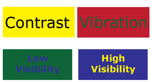
6) What colors should I choose for my sign?
Use of colors is important in making your sign effective. The question is how can I use colors effectively? The answer is contrast.

Look at the graphic to the left. Which letter is larger?
The white one? Well, not quite. The letters are in fact both the same size. It’s a trick of the eye. The dark background makes the letter seem larger.
The Outdoor Advertising Association of America (OAAA) tested color combinations for readability at a distance. Below are the results of that test ranked from #1 – #14.
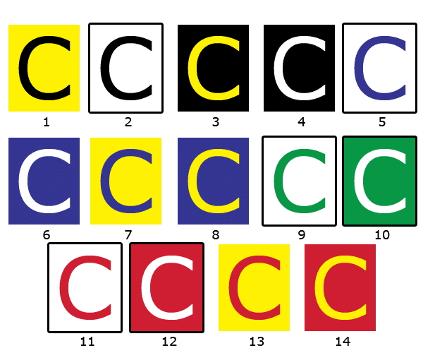
Effects of Color Combinations
7) Do I need a border on my sign?
Adding a border increases the reading speed by 26%. We typically recommended borders when your intended audience is vehicular traffic.
With some thought and careful planning you can present the image you wish and garner the attention you deserve.
If you need some advice on your sign design or layout please stop in and our Sign Technicians can help create the signage that you want.